


Design Problem
There were many problems that I identified with the wayfinding in Letterkenny. The most prominent problem with the wayfinding is that it is completely outdated, this gives the sense that Letterkenny has been neglected. The wayfinding is not unique or attractive in any way, it is simply the same as the rest of the country. There is little to no environmental graphics, which is very visually boring. Most wayfinding is made up of road signs, or businesses display their own wayfinding, which creates a sense of complete inconsistency. The current signs are too text heavy, this complicates wayfinding for non-English speakers. The overall vibe of the wayfinding is that there is no design unification, Letterkenny is quit spread out so an aesthetic of design unification is vital.
There were many problems that I identified with the wayfinding in Letterkenny. The most prominent problem with the wayfinding is that it is completely outdated, this gives the sense that Letterkenny has been neglected. The wayfinding is not unique or attractive in any way, it is simply the same as the rest of the country. There is little to no environmental graphics, which is very visually boring. Most wayfinding is made up of road signs, or businesses display their own wayfinding, which creates a sense of complete inconsistency. The current signs are too text heavy, this complicates wayfinding for non-English speakers. The overall vibe of the wayfinding is that there is no design unification, Letterkenny is quit spread out so an aesthetic of design unification is vital.
Target Audience
My target audience for this project is pedestrians, tourists and drivers in Letterkenny. I want to make navigation easier for everyone that travels to this town. My target audience influenced my design majorly with the scale of my designs. I had to consider the needs of drivers and having to gain directional information quickly and clearly. I strongly considered pedestrians who may not speak English, this is why I created line icons that are very easy to interpret. I also considered the current residents of Letterkenny, they have been stuck with a dull, grey wayfinding system and I want to brighten up their town and make it attractive.
My target audience for this project is pedestrians, tourists and drivers in Letterkenny. I want to make navigation easier for everyone that travels to this town. My target audience influenced my design majorly with the scale of my designs. I had to consider the needs of drivers and having to gain directional information quickly and clearly. I strongly considered pedestrians who may not speak English, this is why I created line icons that are very easy to interpret. I also considered the current residents of Letterkenny, they have been stuck with a dull, grey wayfinding system and I want to brighten up their town and make it attractive.
Objective
My main objective was to create a positive and modern wayfinding system. It will be easily navigated, with bright colours and a modern aesthetic. This wayfinding system will unify Letterkenny's facilities and attractions through design unification.
Wayfinding Solution
For my choice of colour I wanted bright, but not neon bright colours. I choose bright colours that you might find in nature, e.g. sky blue, raspberry smoothie magenta. I think these colours really stand out against my dark navy backgrounds, they all complement each other well. For typography, I decided to use the font Gotham (book, medium & light). I chose this font against all of my other options because I think it is very legible and it is very modern
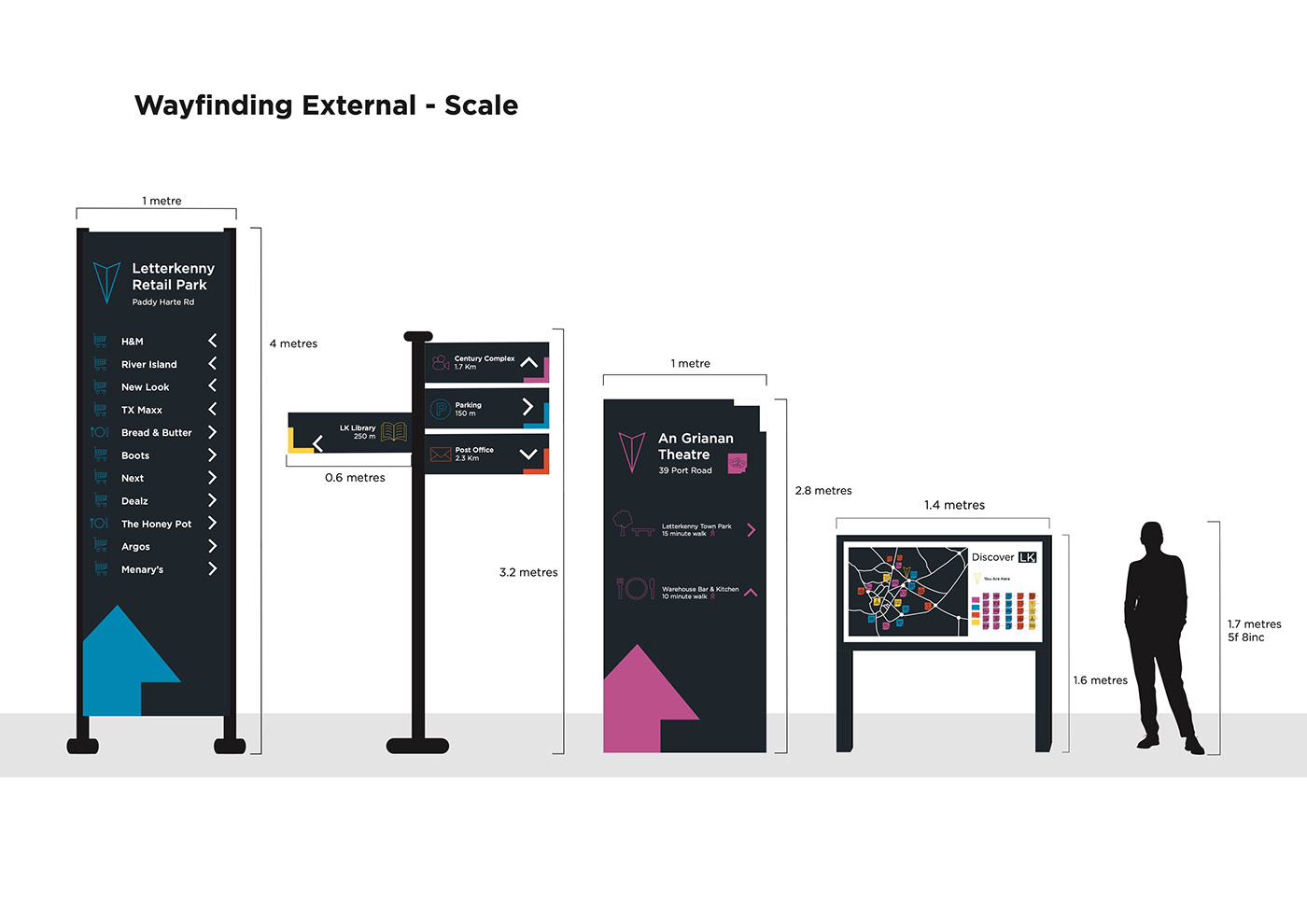
and fresh, compared to the overly used Helvetica. For my icons, I created a all range of simple line icons that are easily recognized. For the colours, I made the main Fons the same dark navy as the backgrounds of the signs, for some designs the line icons are the same colour as their corresponding colour coding, this lessens confusion. These icons will make navigating Letterkenny a lot easier. For the map, I created it with simple lines and negative space. I wanted the map to be as simple as possible, because realistically many people are not expert map readers. I added the correct icons to their location on the map and put the icon legend adjacent to the map. This simple design will mostly help pedestrians navigate the towns attractions. The material I decided to use for the structures is aluminum with a plastic coating for the designs. After a bit of research, I discovered that aluminum does not rust, so in the long run this material will be the most cost-efficient. The sale of my structures is hopefully very realistic. I wanted to make them stand out, so I made their dimensions a moderate size. Especially for the Retail park sign, it had to be quite large for drivers to view it efficiently. My choice of location was to pinpoint the main areas of Letterkenny that people recognize, and use these locations to direct to other, maybe less recognized, areas. For example, placing a main structure at the An Grianan Theatre, a very well-known destination, helps direct users to less notable areas, such as the town park.
For my choice of colour I wanted bright, but not neon bright colours. I choose bright colours that you might find in nature, e.g. sky blue, raspberry smoothie magenta. I think these colours really stand out against my dark navy backgrounds, they all complement each other well. For typography, I decided to use the font Gotham (book, medium & light). I chose this font against all of my other options because I think it is very legible and it is very modern
and fresh, compared to the overly used Helvetica. For my icons, I created a all range of simple line icons that are easily recognized. For the colours, I made the main Fons the same dark navy as the backgrounds of the signs, for some designs the line icons are the same colour as their corresponding colour coding, this lessens confusion. These icons will make navigating Letterkenny a lot easier. For the map, I created it with simple lines and negative space. I wanted the map to be as simple as possible, because realistically many people are not expert map readers. I added the correct icons to their location on the map and put the icon legend adjacent to the map. This simple design will mostly help pedestrians navigate the towns attractions. The material I decided to use for the structures is aluminum with a plastic coating for the designs. After a bit of research, I discovered that aluminum does not rust, so in the long run this material will be the most cost-efficient. The sale of my structures is hopefully very realistic. I wanted to make them stand out, so I made their dimensions a moderate size. Especially for the Retail park sign, it had to be quite large for drivers to view it efficiently. My choice of location was to pinpoint the main areas of Letterkenny that people recognize, and use these locations to direct to other, maybe less recognized, areas. For example, placing a main structure at the An Grianan Theatre, a very well-known destination, helps direct users to less notable areas, such as the town park.
